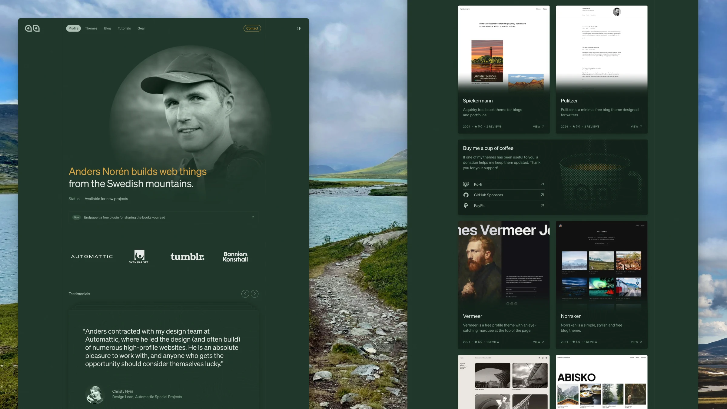
The new andersnoren.se is live. I’ve started blog posts with some variation of that sentence more times than I care to count, but I don’t think I’ve been this happy with the end result before.
A redesign was long overdue, but the timing isn’t happenstance. For close to four years, I’ve mostly worked as a contractor for Automattic’s Special Projects team. Now I’m taking on clients of my own again, and that felt like the right moment to finally give the site the overhaul it needed. More on those four years in a future blog post.

Why it needed to change
The old design of andersnoren.se was built with my work in mind: free WordPress themes, blog posts about WordPress, and the occasional update about life stuff. For a long time, that was most of what I published here.
I still write about all that – I launched a WordPress tutorial section not that long ago, after all – but it’s not all I write about. Since I picked up hiking during the pandemic, I’ve been mixing in blog posts about my outdoor adventures and the gear that comes with them. They sat awkwardly in the monochrome and minimal design I’ve used here for the past few years, though. More importantly, that design didn’t feel like me anymore.
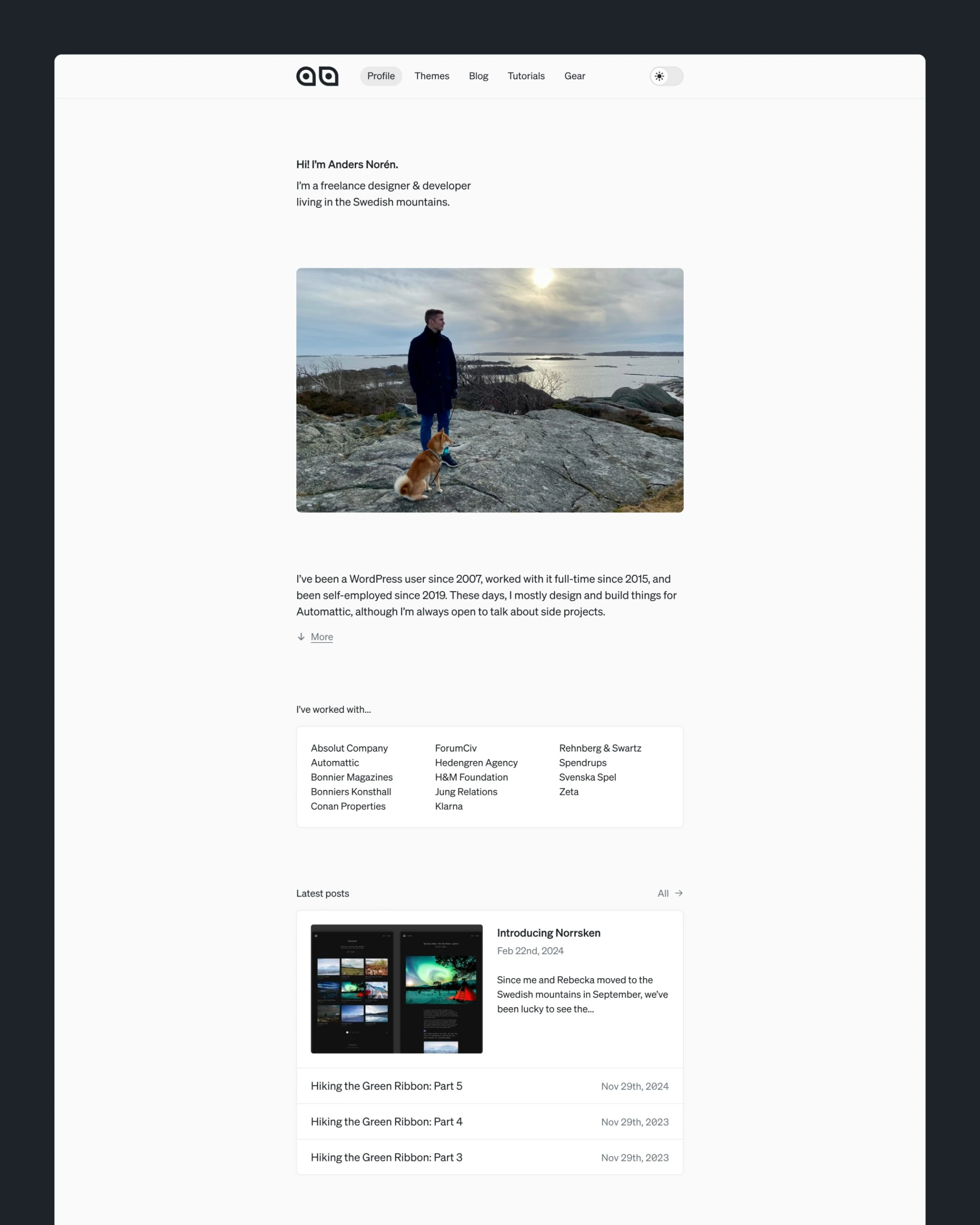
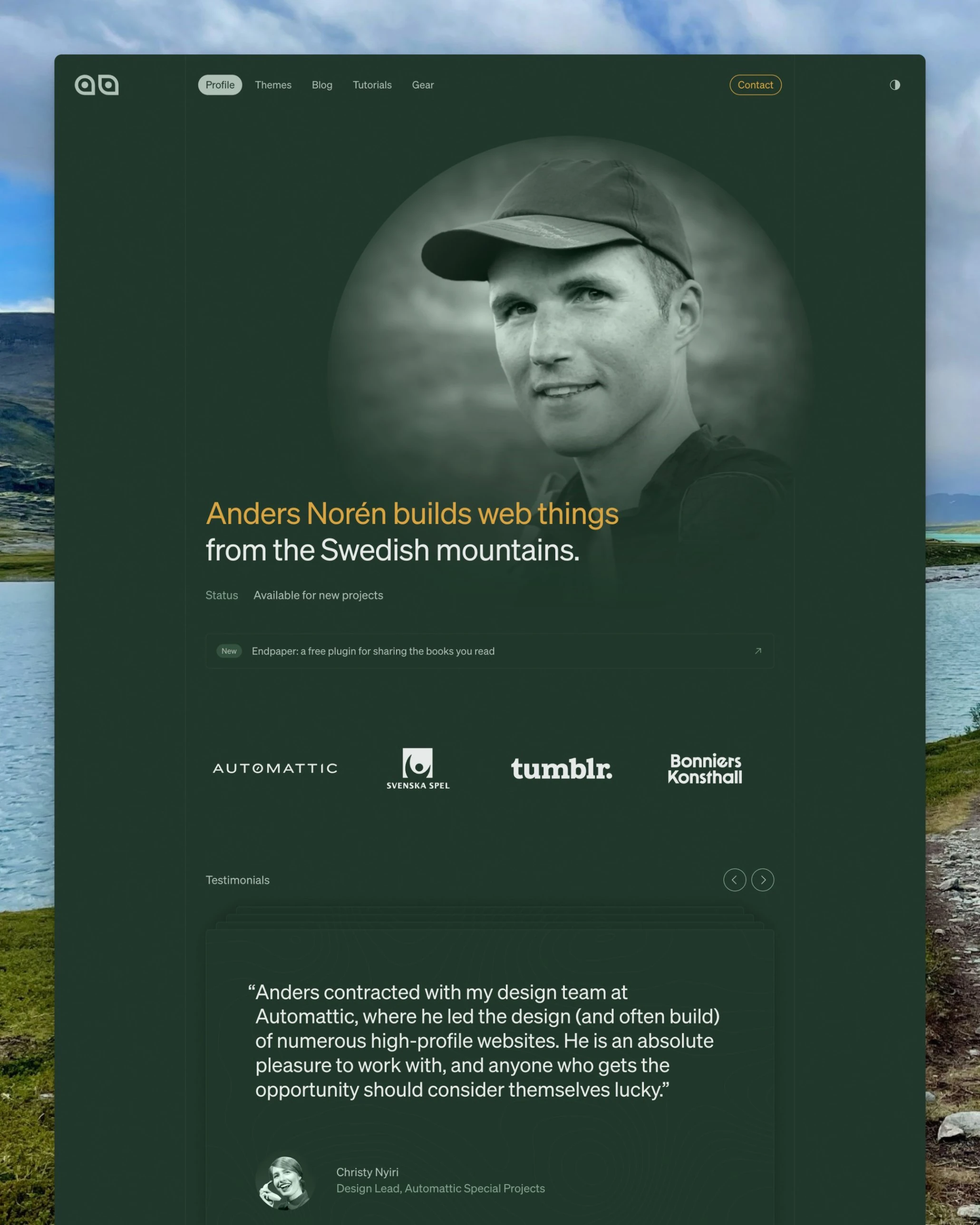
The goal of this redesign was a site where client work, free WordPress themes and very long blog posts about adventures in the Swedish mountains could sit side by side without either looking like the Babadook at a wine night.
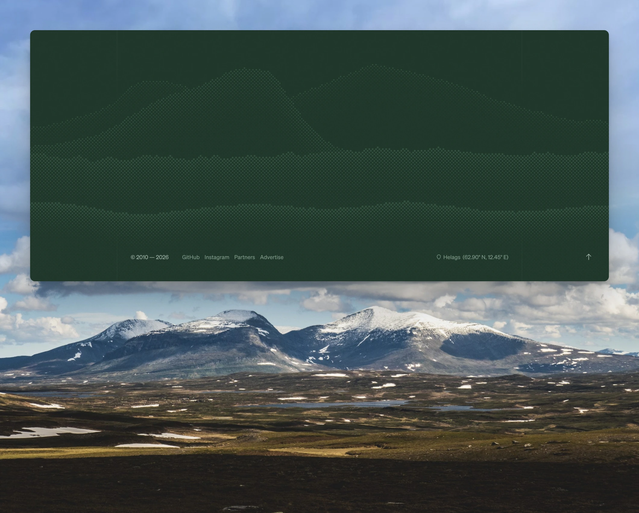
That’s why the design takes its cues from the mountains: pine forest green with accents of cloudberry yellow, topographic lines, and a footer with the silhouette of Helags, which is the tallest mountain in these parts and home to Sweden’s southernmost glacier. Click the coordinates in the footer to take in the view from the top.
Under the hood
I designed the new site in Figma, and decided on the green color scheme and grid-heavy layout with vertical rules framing the content early on. Choosing a typeface was easy as well, since I never seriously considered switching out the lovely Söhne from Klim Type Foundry. This time, it’s set almost exclusively in the Buch weight.
For the not-so-fun stuff, like troubleshooting colors for the light mode, applying missing color tokens and generating rough first drafts for mobile layouts, I brought in Claude.
Claude was a lot more involved when it came to actually building the site. My job was to review its work, push back when something was off, and make sure it followed best practices for building block themes instead of constantly taking shortcuts. Left to its own devices, Claude will happily hard-code CSS that can just as easily be set in the block editor. It required a lot of back and forth. Whenever I got sloppy and let Claude do too much without adult supervision, I regretted it once I got around to reviewing the work.
Every change Claude made bumped the version number in style.css. It started at 1.0.0. On launch day, it read 1.0.1066, which gives you an idea of how many small adjustments have gone into the theme over the past two weeks. Still, it’s been a lot smoother than I feared, and with Claude’s can-do attitude, I got in quite a few fun features and easter eggs. I’m particularly happy with the 404 page.
Available for work
Since I’m taking on clients again: if you need help with a WordPress site, from small adjustments to a complete redesign, send me an email at anders@andersnoren.se.
If you work with anything related to the outdoors, I’d be especially happy to hear from you. We can geek out about lightweight hiking gear on our Zoom calls.


