Earlier this week, I realized that I wasn’t all that happy with the theme this site was running.
That in and of itself is nothing new – in this profession, a perpetual state of unhappiness with your own site is pretty much a given – but it usually takes longer than the nine months that have passed since my latest redesign, Overture. Looking at it now, it just felt… Heavy. As if it could start to slide right off the screen at any moment.
Maybe I can get around to it this Christmas, I figured, when things have calmed down with work and I have some time off. Still, I might as well play around with some ideas in Sketch. Just to get a feel for it.
Yeah… About that.
The latest version of my site went live yesterday. It is pretty much the opposite of the old one – clean, simple and very lightweight. The design is also my first in a long while to be grid based (four columns with a 20px gutter on desktop). I had Making and Breaking the Grid by Timothy Samara and Grid Systems in Graphic Design by Josef Müller-Brockmann next to me on the coffee table for most of the design and development, and I borrowed the latter authors last name when baptizing the theme.
I’ve replaced Industry and Abril Text with a single sans-serif typeface, the lovely Aktiv Grotesk by Dalton Maag, and done away with colors altogether. The one icon on the site, on the 404 page, comes from the Linea icon set by Dario Ferrando. The average page size has been cut in half, as has the number of lines of CSS.

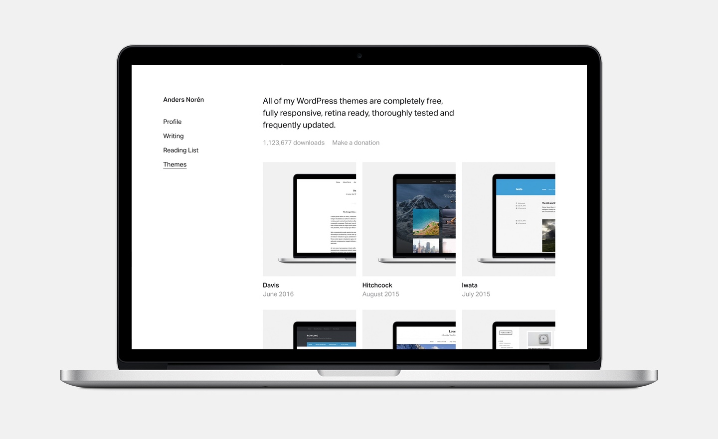
I’ve killed the front page and replaced it with the profile page, since the front page previously was little more than three really big links to the pages visitors were actually interested in. The blog is now more of an archive than a blog, with a few featured pieces above a single chronological list of all posts. Probably for the best, considering how often I update it. The theme pages have been simplified and cleaned up, but are structurally pretty much the same as before.
The only addition to the site is the Reading List, which uses the Goodreads API to display a list of the books that I’ve read recently. I’ve become a heavy Goodreads user in the past year, and adding the Reading List to the site was a fun little experiment.
All in all, I’m happy with the redesign. I say this every time, but I actually think this one might last longer than the previous one. That would be a first. As always, any and all feedback is extremely welcome.

I’ve been asked on and off in the past year what theme I was using and whether it was available for download anywhere. Since I’m not using Overture myself anymore, it is now. I’ve stripped out the ”Theme” custom post type and replaced the Typekit fonts, and you’ll need to add your own Twitter keys to get the latest tweet output in the footer. Also, fair warning: I’m not quite as thorough when it comes to translation-ready strings, not using hard coded links and stuff like that on themes for my personal site. All that being said, you can find a zip file here. Hopefully, some part of it is useful to someone.
As this is my first post in a good long while, a status update on my upcoming theme, Davis, might be in order. The theme is still in the theme Review Queue on WordPress.org, and it’s slowly creeping its way towards the top. With how the queue is looking now, I’d guess that it will be about two more months before it’s approved and available in the theme directory. If you feel daring, you can download it now through this link. Let me know if you run into any issues, and I’ll fix them in time for its proper release on WordPress.org.