Midsummer brought with it great food, beer and time to do a new design for this here website.
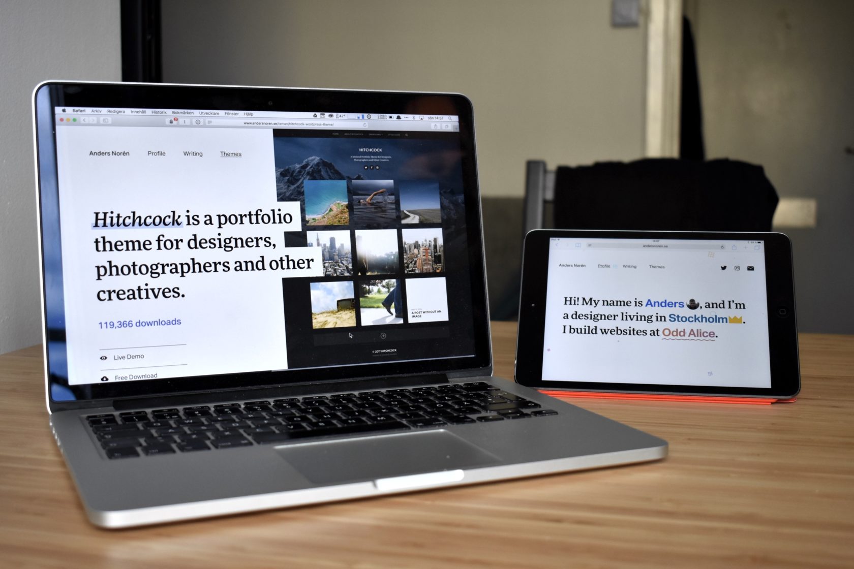
The new design for the site is more of a development of the old one than a complete overhaul. It still uses the same sans-serif typeface, Aktiv Grotesk by Dalton Maag, which remains one of my favorite workhorse type families. I had initially planned on using only Aktiv Grotesk, but in heftier weights for titles (which would’ve looked something like this). That was before I stumbled over the serif type family FF More by FontFont being used for titles. It was love at first sight.

I’ve scrapped the old Goodreads-connected Reading List page, as I didn’t like the real estate it took up in the main menu. I’ve beefed up the theme pages considerably with more information, substantially bigger images and typography with more contrast. I’ve also added some color into the previous black-and-white mix – #3C48D5 is the accent color strewn around the site.
I didn’t really have a great excuse to do a redesign this time around, seeing how I was still reasonably happy with the design that the site had been running from Fall 2017 onwards. Still, I got the itch to try out some ideas. A couple of ideas turned into a couple of artboards in Sketch, that turned into some testing in Brackets, and before I knew it, I had suckered myself into taking the drafts far enough to where I figured that I might as well see it all the way through.